FEA110 - Enhance color contrast for color blindness
| Feature ID | FEA110 |
| Subsystem the feature is part of | Enhance color contrast for color blindness |
| Responsible person | TBD |
| Status | Work in Progress |
Description
It is important to make our service available to everyone via good accessibility standards, and color options for color blindess in a must have to increase Tukkos usage amongst everyone.
Restrictions, requirements and use cases related to this feature
All relevant issues related to or contributing to the definition of the feature are gathered here
| Use Case 1 | |
| Use Case 2 | |
| Requirement ReqID | |
| Requirement ReqID |
Preliminary user stories
- As a user with color blindness, I want the web app to have sufficient color contrast between text and background elements, so that I can easily read and understand the content. US046
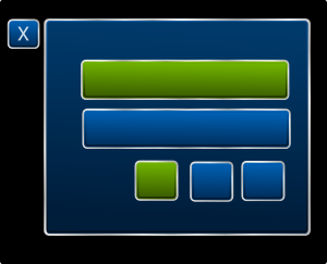
User interface mock-up
Add a picture or a link here. The mock-up should be essentially related to the feature/functionality.
Testing / possible acceptance criteria
Write down some notions for testing
| Testcase | Test source | Responsible |
|---|---|---|
| TC110-001 | ACC-REQ-0001 | Ville-Veikko Vähäaho |